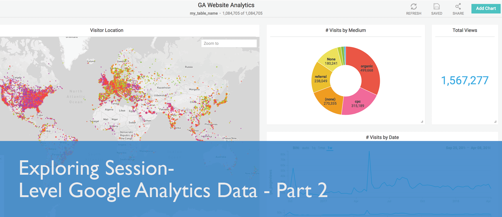
Exploring Session-Level Google Analytics Data - Part 2
Try HeavyIQ Conversational Analytics on 400 million tweets
Download HEAVY.AI Free, a full-featured version available for use at no cost.
GET FREE LICENSEPart 1 of this blog series walked through the steps for enabling Google Analytics API and setting up a service account. It described the MapD Google Analytics Importer Application that downloads raw, session-level Google Analytics data in CSV format for a specified date range. The downloaded data can be imported into MapD automatically by the application or it can be imported manually using the MapD Immerse Data Manager interface. With the Google Analytics data now loaded into MapD, we are ready to explore it by connecting to Immerse at port 9092 on the MapD server instance with your browser.
Using MapD Immerse you can visually interact and analyze the Google Analytics session data to determine how people get to your website. Immerse provides instantaneous representations of your data, from basic charts to rich and complex visualizations. Charts are comprised of measures and dimensions. Measures are quantitative or numerical values or aggregated values (SUM, AVG etc). Dimensions categorize measures and used for grouping of data. A Detailed explanation of the different chart types and Immerse features can be found in the Immerse User Guide.
Google Analytics provides a number of dimensions to describe where and how someone comes to your website to help identify whether the visit was organic, or through AdWords or a referral website. Here is a list of the Google Analytics dimensions captured by the Python application:
ga_date
ga_networkLocation
ga_medium
ga_deviceCategory
ga_longitude
ga_pageviews
ga_source
ga_campaign
ga_latitude
ga_country
ga_sessionDurationBucket
ga_adContent
ga_landingPagePath
ga_city
ga_sessionCount
ga_keyword
For a detailed explanation of the different dimensions used in Google Analytics please refer to Dimensions & Metrics Explorer. In the rest of the blog, I will explain the different charts that I created to understand the traffic pattern to the MapD website.
Pointmap
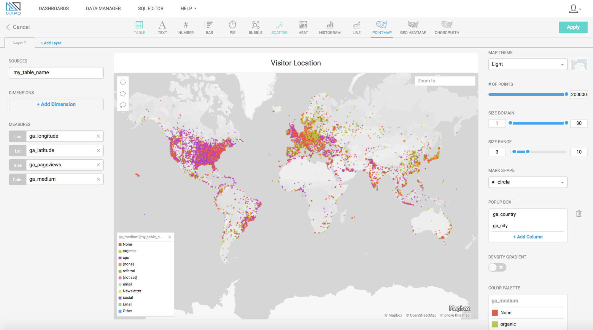
To understand the website traffic from a location perspective, I created a Pointmap where each record in the table is an individual point on the map. I used the ga_longitude and ga_latitude to define the location point and the page views for the point size measure. To get a global view of where the website visits originated I use the ga_medium for the color of the points. Based on the legend of the colors I immediately know whether the visitor came through AdWords or organically through a search engine or referred from another website or directly. As I hover over the world map, I want to know the exact location information so under the PopUp box I added the dimensions ga_city and ga_country.
Bar, Table, and Line Charts
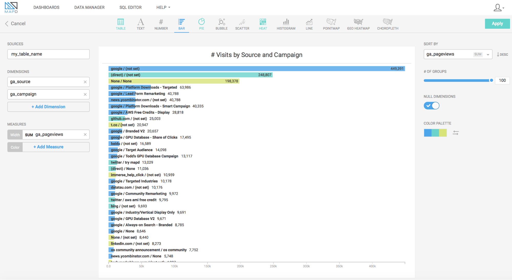
Next, I created a Bar Chart using the ga_source and ga_campaign for the dimension and the sum of ga_pageviews as the measure. This bar chart shows the number of website visitors that came through Google with AdWords or manual campaign tagging or a search engine or referring site or directly.
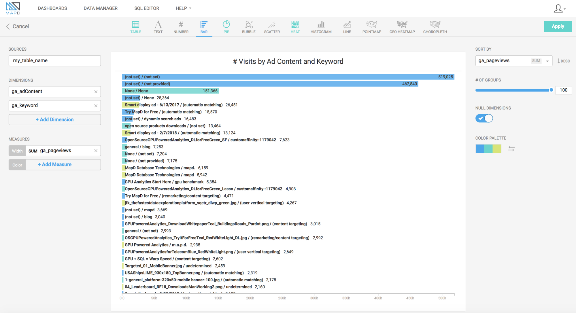
In addition to seeing the Medium, Source, and Campaign, I would like to see any bid keyword and ad headline. So I created a Bar Chart using ga_adContent and ga_keyword as the dimension and the sum of ga_pageviews as the measure.
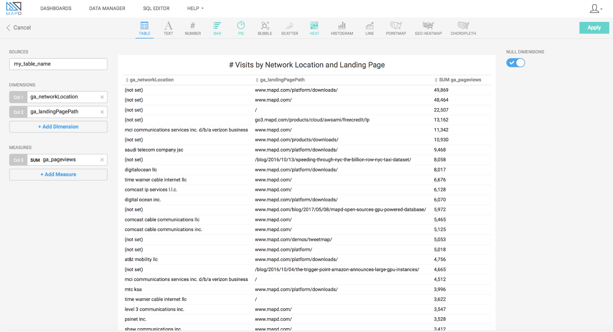
I also created a table with the dimensions ga_networkLocation and ga_landingPagePath using the sum of ga_pageviews as the measure to complement the information from the previous chart.
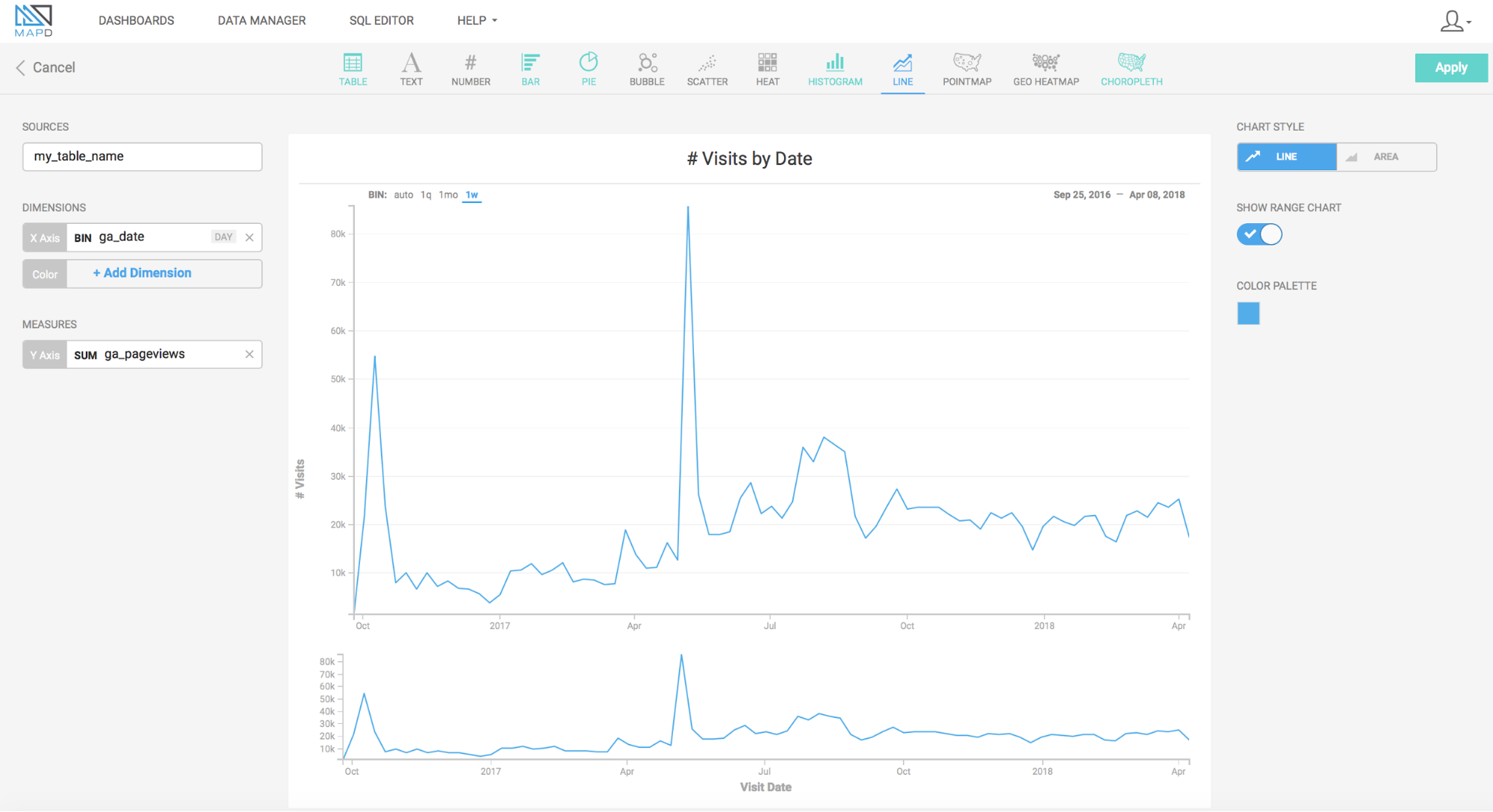
Now that I have the information needed to know where a visitor to the website is coming from and how they got there, I would like to know the time period of their visit. For this, I created a Line Chart with ga_date for the x-axis dimension and sum of ga_pageviews for the measure. I also enabled the Range Chart which allows me to brush across a time range and filter a smaller number of data points. On my line chart, I saw spikes in the number of visitors to the website which coincided with the timing of various company announcements.
Immerse Crossfilter
Now that I have all my charts in the dashboard, I can click around on some of the chart elements, zoom in or out on the point map and brush across a time range, and watch the other charts on the screen update instantaneously. This feature of MapD Immerse is called crossfilter, which allows a filter applied to one chart to simultaneously be applied to the rest of the charts on a dashboard. This is possible even with very large data sets because MapD is not pre-indexing or aggregating any of the data and you get a completely granular view of the data in real time.
MapD Immerse allows you to apply Global Filters at the dashboard level as well, constraining data for all charts on the dashboard. I wanted to find all traffic to the website that is classified as Direct by Google Analytics. A direct access is when the visitor types the website URL or uses bookmarks or copy+pastes the URL. In this case, the ga_medium is set to (none) and the ga_source is direct. We can set the global filter by clicking Filters at the upper left-hand corner, then click +Add Filter, select the Google Analytics table as the Data Source, select ga_medium as the filter dimension, select CONTAINS and in the value drop-down select (none). Similarly, add another global filter for ga_source, select CONTAINS and in the value select direct. All the charts will apply this filter instantaneously and using the ga_landingPagePath, I noticed that most of the direct visitors came to the software download page (www.mapd.com/platform/downloads).
Watch MapD Crossfilter in action!

Importing Sample Dashboard
I have created a JSON definition file for the dashboard that I created above. You can download the template file from S3. You should upload the Google Analytics data to MapD and give the table a name of your choice. The template file has placeholder for the table name (SAMPLE_TABLE_NAME) and the dashboard name (SAMPLE_DASHBOARD_NAME). Run the sed command to replace all occurrences of these with your table name and dashboard name. In the example below, I am using my_table for the table name and my_dashboard for the dashboard name.
- Type the S3 URL on your browser to download the dashboard template file(GA_sample_dashboard.template).
- Make a copy of the template file as you will be substituting the placeholder table & dashboard names with the actual names.$ cp GA_sample_dashboard.template GA_sample_dashboard.new
Using mapdql which is the client-side SQL console, run the following command to import the dashboardmapdql> \import_dashboard GA_Website_Analytics,/tmp/GA_sample_dashboard.new
Voila! Now under Immerse DASHBOARDS you should see the newly imported dashboard with your website’s Google Analytics data.

We welcome your suggestions for improvement and any questions on this topic at our community feedback forum.


